 Innovative Logo Design: Warm, Simple, and Quirky
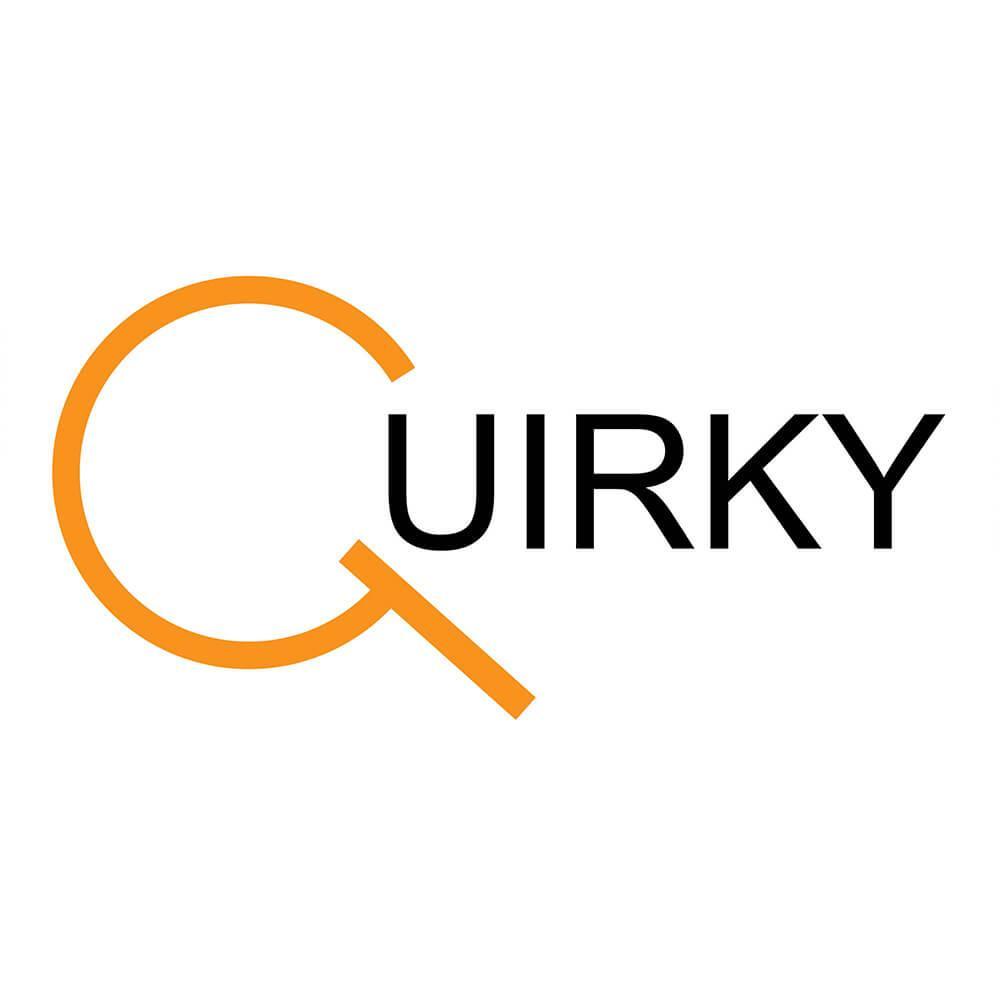
The Quirky Logos Design Project offered a platform to showcase innovative creativity while adhering to the client’s specific branding requirements. By using a color palette of orange, green, and black, the designs were crafted to reflect the warmth, simplicity, and distinctiveness desired by the client. Extensive research guided every aspect of the project, ensuring that the final logos were not only visually appealing but also aligned with the client’s values and vision.
Each color played a crucial role in the designs, whether used individually or combined for striking effects. Orange evoked warmth and energy, green symbolized vitality, and black added sophistication and contrast.
Creative Graphic Logo Design – Quirky
Together, these colors encapsulated the business’s spirited and approachable personality. The process involved careful conceptualization, iterative refinement, and attention to detail, resulting in a set of unique logos that conveyed both friendliness and quirkiness. The final outcome exceeded expectations, leaving a lasting impression and providing the client with branding that stood out in a competitive marketplace.


